The Joan Ganz Cooney Center is Sesame Workshop’s independent research and innovation lab. Named for one of the creators of Sesame Street, the JGCC conducts research on emerging technologies to understand how children learn through digital media. I was tasked with redesigning their old site to better reflect the JGCC’s tech-forward mission. As UX designer and Art Director, I improved the flow of the site, made it responsive, and refreshed the overall look and feel. Keep scrolling to learn more about the process!
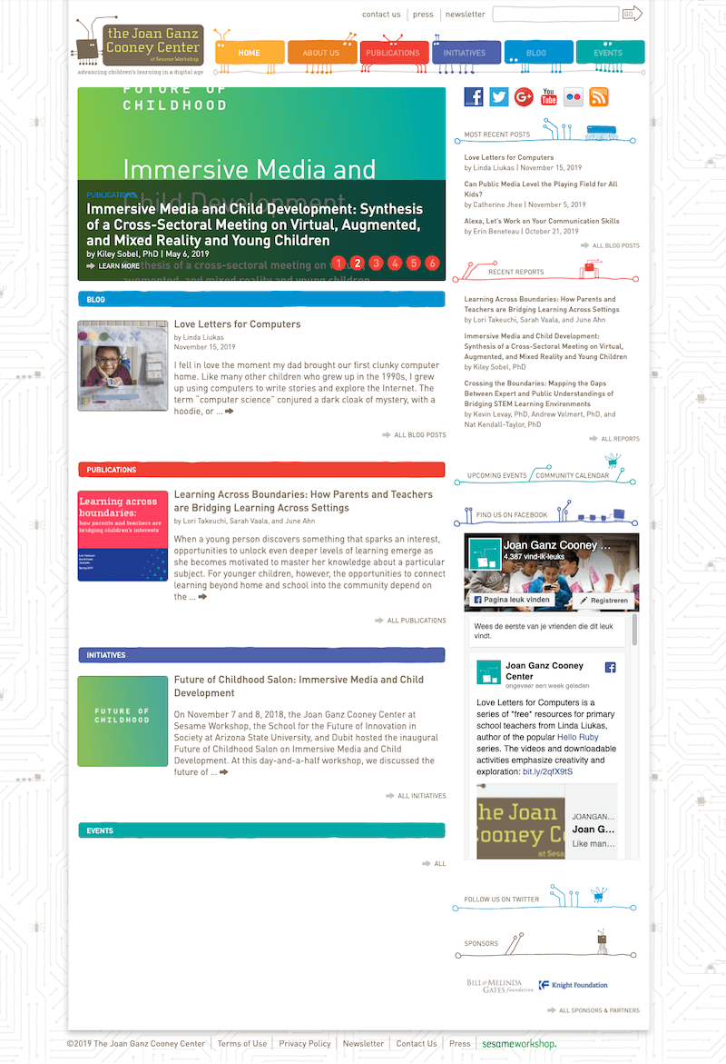
The Old Site
The previous JGCC site had not been overhauled in several years. A lot of out-of-date web design conventions still lingered, including a narrow max width, lack of responsiveness, and widgets that auto-populated. Due to the auto-populating widgets, and a lack of a clear design system, it was difficult to curate what was featured on the homepage. Users were shown long, automated excerpts of posts before clicking into them. Lack of clear labeling and thumbnail styles caused confusion about what was a blog, what was a publication, etc.
This lack of curation persisted across the site. Multi-page sections, such as “About,” lacked landing pages that could streamline user flow. Important pages were difficult to find, and there was little hierarchy to help users find what they needed.
Stylistically, the JGCC had a recognizable look that felt familiar and whimsical to users. Stakeholders felt that the “microchip” and “bug” design elements were true to the personality of the JGCC brand – a reference to technology and playfulness. I proposed a look that could carry over some of these sentiments, while also elevating the visuals to look more contemporary and professional.
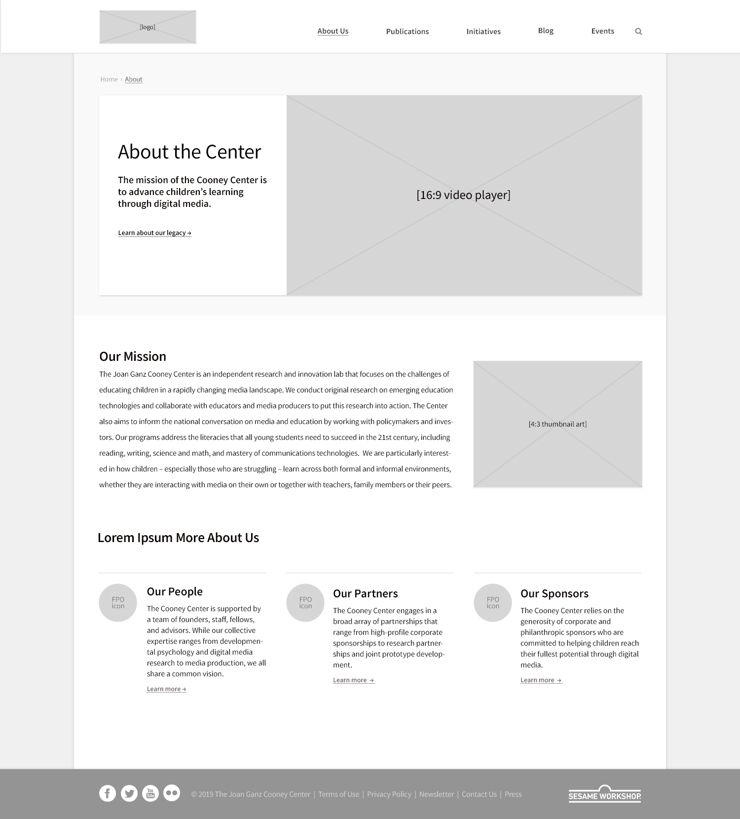
Wireframes
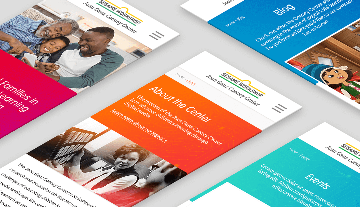
After working with stakeholders to identify how the site structure, navigation, and flow could be improved, I created mockups for web and mobile to map out the new site. The biggest additions included new landing pages and inside pages that could easily be navigated through. The new site would also give site administrators more control over how they could display content.
Art Direction
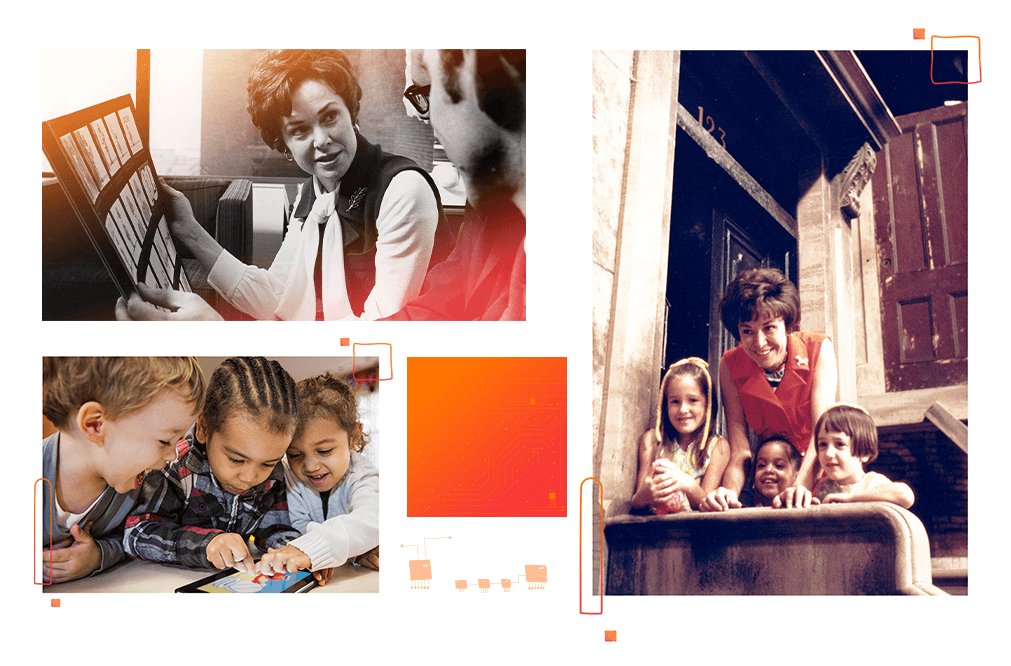
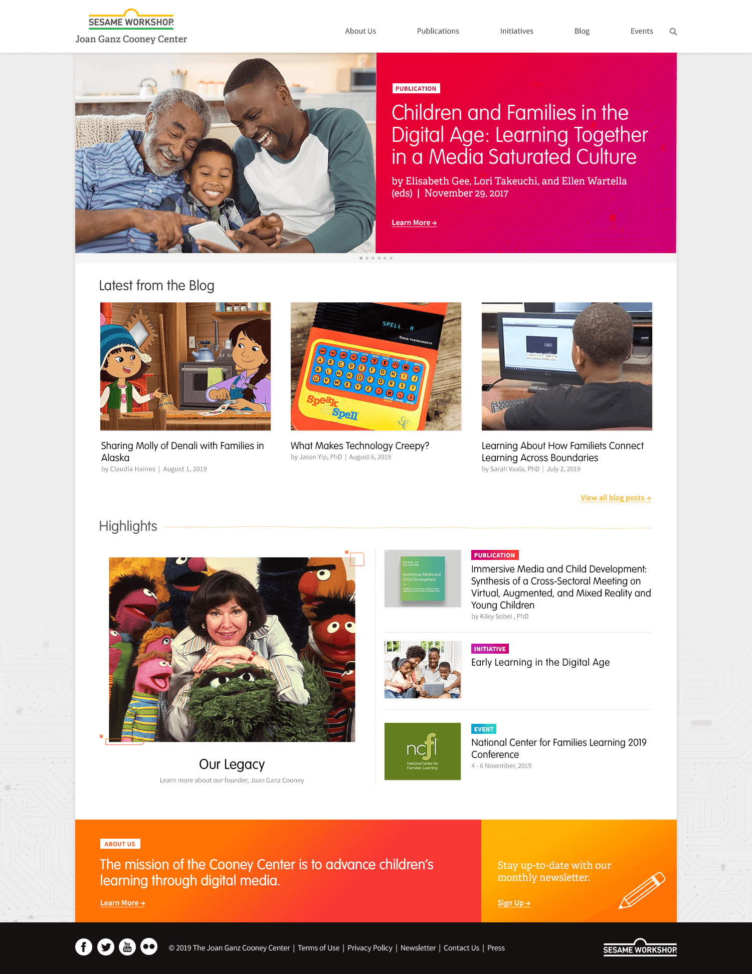
The look & feel that I developed for Joan Ganz Cooney Center took their original brand motifs like microchips and robotic bugs, but toned them down for a more professional look. Vintage photos of Joan Ganz Cooney were given a contemporary edge with bright flares and illustrative bursts.
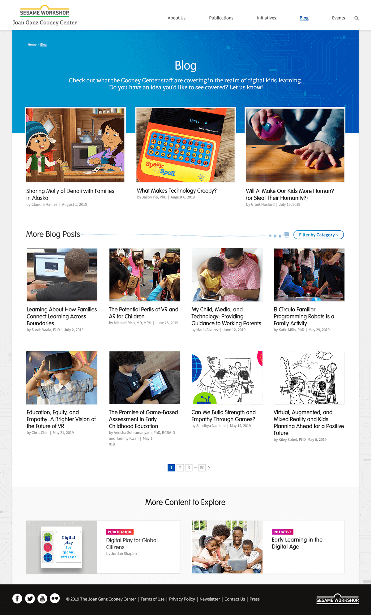
I developed a color system with corresponding gradients assigned to each section of the site. Each section also would get its own thumbnail style, so users could see at a glance if they were linking to a blog, publication, initiative, or event. This visual system would help users feel grounded in the site no matter how they navigated.
The Result
New Homepage
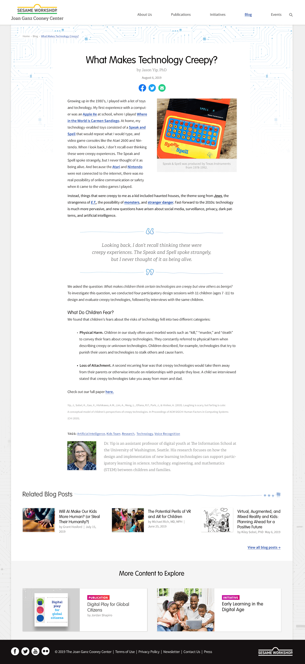
Blog Landing & Inside Pages
Content flows are now more navigationally and visually intuitive. The “Blog” section of the site adapts a blue color scheme that carries over from landing to inside pages. Blog posts have a fixed width that convert easily to mobile. Both feature related content above the footer to keep users circulating through the site.


